
1. Simple Blue Login Page
This is the cleanest and easiest design — a centered card with a soft blue background.
Here are steps to design
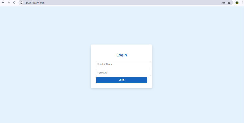
steps:
- Create an
index.htmlfile. - Add a centered
divfor the login box. - Style the background with a light blue color.
- Add rounded input fields and a blue button.
<!DOCTYPE html>
<html lang="en">
<head>
  <meta charset="UTF-8">
  <meta name="viewport" content="width=device-width, initial-scale=1.0">
  <title>Simple Blue Login</title>
  <style>
    body {
      display: flex; justify-content: center; align-items: center;
      height: 100vh; background: #e3f2fd; font-family: sans-serif;
    }
    .login-box {
      background: white; padding: 2rem; border-radius: 10px;
      box-shadow: 0 5px 15px rgba(0,0,0,0.1); width: 320px;
    }
    h2 { text-align: center; margin-bottom: 1rem; color: #1565c0; }
    input { width: 100%; padding: 10px; margin: 8px 0;
      border: 1px solid #ccc; border-radius: 6px; }
    button { width: 100%; padding: 10px; border: none; border-radius: 6px;
      background: #1565c0; color: white; font-weight: bold; cursor: pointer; }
    button:hover { background: #0d47a1; }
  </style>
</head>
<body>
  <div class="login-box">
    <h2>Login</h2>
    <input type="text" placeholder="Email or Phone" />
    <input type="password" placeholder="Password" />
    <button>Login</button>
  </div>
</body>
</html>
2. Animated Login Page
These login page is very attractive and with smooth transition,
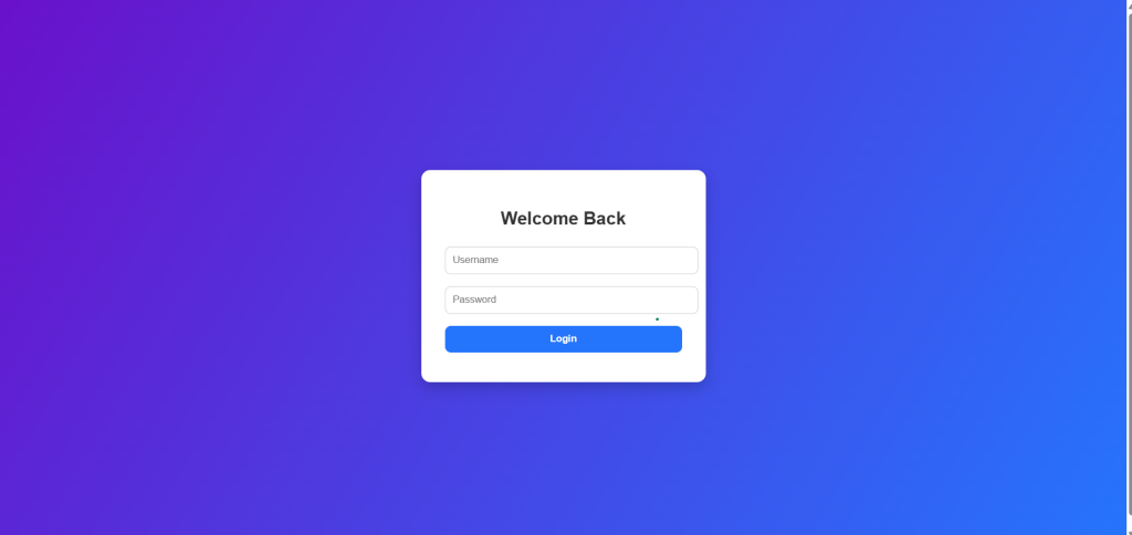
Here we add a subtle fade-in animation to the login box.
TO design here are the steps
- Start from the simple design.
- Add CSS animation with
@keyframes fadeIn. - Animate the login card when the page loads.
<!DOCTYPE html>
<html lang="en">
<head>
  <meta charset="UTF-8">
  <meta name="viewport" content="width=device-width, initial-scale=1.0">
  <title>Animated Login</title>
  <style>
    body {
      display: flex; justify-content: center; align-items: center;
      height: 100vh; background: linear-gradient(120deg,#6a11cb,#2575fc);
      font-family: sans-serif;
    }
    .login-box {
      background: white; padding: 2rem; border-radius: 12px;
      box-shadow: 0 8px 20px rgba(0,0,0,0.2); width: 320px;
      opacity: 0; transform: translateY(-50px);
      animation: fadeIn 1s forwards;
    }
    @keyframes fadeIn {
      to { opacity: 1; transform: translateY(0); }
    }
    h2 { text-align: center; margin-bottom: 1rem; color: #333; }
    input, button { width: 100%; padding: 10px; margin: 8px 0;
      border-radius: 8px; border: 1px solid #ccc; }
    button { background: #2575fc; color: white; border: none; font-weight: bold; }
    button:hover { background: #1a5ed8; }
  </style>
</head>
<body>
  <div class="login-box">
    <h2>Welcome Back</h2>
    <input type="text" placeholder="Username" />
    <input type="password" placeholder="Password" />
    <button>Login</button>
  </div>
</body>
</html>
3. Dark Mode Login Page
The dark mode login page is important for professional developers, so lets create very attractive dark mode login pages. And also modern website uses dark mode login pages.
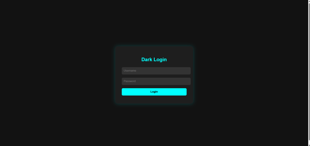
To create dark model login page follow the following steps.
- Use a dark background.
- Light text with high contrast.
- Neon-colored login button.
<!DOCTYPE html>
<html lang="en">
<head>
  <meta charset="UTF-8">
  <meta name="viewport" content="width=device-width, initial-scale=1.0">
  <title>Dark Login</title>
  <style>
    body {
      display: flex; justify-content: center; align-items: center;
      height: 100vh; background: #121212; color: #eee; font-family: sans-serif;
    }
    .login-box {
      background: #1e1e1e; padding: 2rem; border-radius: 12px;
      box-shadow: 0 0 20px rgba(0,255,255,0.2); width: 320px;
    }
    h2 { text-align: center; margin-bottom: 1rem; color: #0ff; }
    input, button { width: 100%; padding: 10px; margin: 8px 0;
      border-radius: 6px; border: none; }
    input { background: #333; color: #fff; }
    button { background: #0ff; color: #000; font-weight: bold; cursor: pointer; }
    button:hover { background: #0cc; }
  </style>
</head>
<body>
  <div class="login-box">
    <h2>Dark Login</h2>
    <input type="text" placeholder="Username" />
    <input type="password" placeholder="Password" />
    <button>Login</button>
  </div>
</body>
</html>
4. Glassmorphism Login Page
This trendy design gives a frosted glass effect.
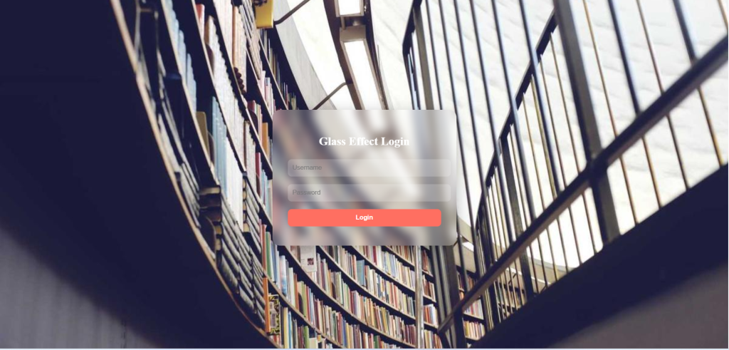
steps to design
- Use a background image or gradient.
- Make login card transparent with
backdrop-filter. - Add blur for a glass look.
<!DOCTYPE html>
<html lang="en">
<head>
  <meta charset="UTF-8">
  <meta name="viewport" content="width=device-width, initial-scale=1.0">
  <title>Glass Login</title>
  <style>
    body {
      height: 100vh; display: flex; justify-content: center; align-items: center;
      background: url('https://picsum.photos/1200/800') no-repeat center/cover;
    }
    .login-box {
      background: rgba(255,255,255,0.15);
      padding: 2rem; border-radius: 16px; width: 320px;
      color: #fff; backdrop-filter: blur(10px);
      box-shadow: 0 8px 30px rgba(0,0,0,0.3);
    }
    h2 { text-align: center; margin-bottom: 1rem; }
    input, button {
      width: 100%; padding: 10px; margin: 8px 0; border-radius: 8px; border: none;
    }
    input { background: rgba(255,255,255,0.2); color: #fff; }
    button { background: #ff6f61; color: white; font-weight: bold; cursor: pointer; }
    button:hover { background: #ff3d2e; }
  </style>
</head>
<body>
  <div class="login-box">
    <h2>Glass Effect Login</h2>
    <input type="text" placeholder="Username" />
    <input type="password" placeholder="Password" />
    <button>Login</button>
  </div>
</body>
</html>
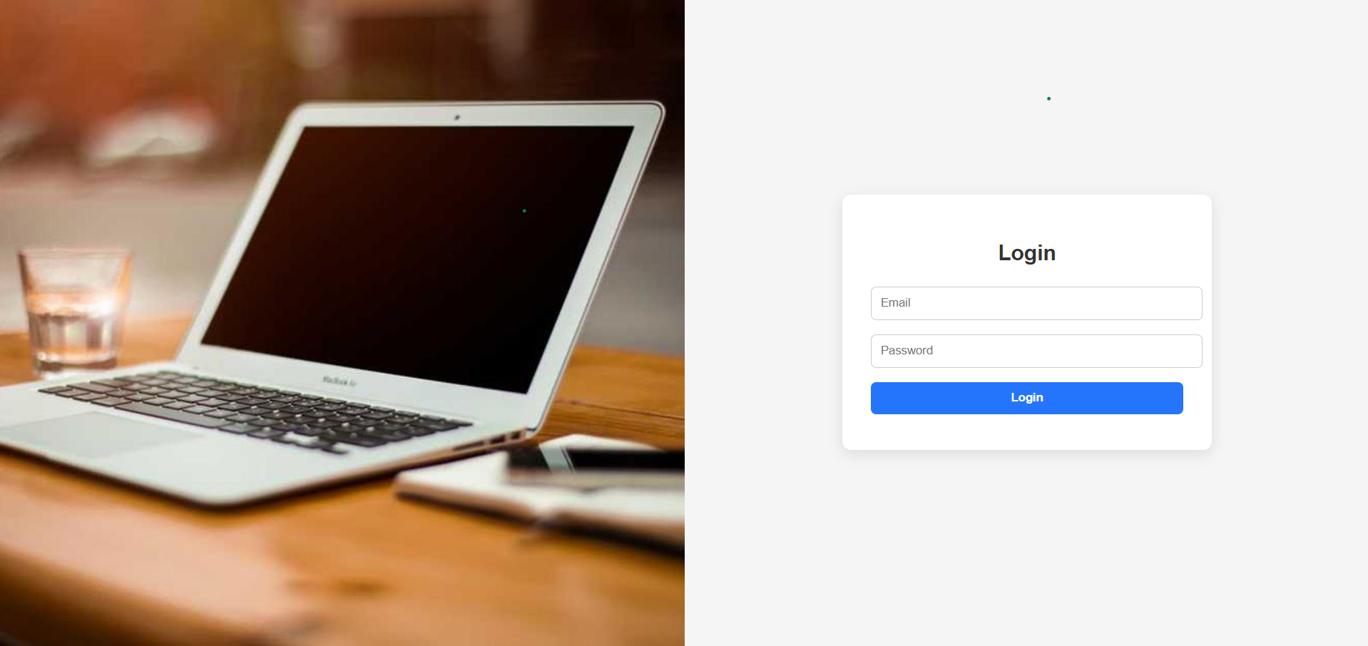
5. Split-Screen Login Page
This design splits the page into two halves: image on the left, form on the right.

steps to create these login follow the following steps.
- Create a container with two columns.
- Left side: background image.
- Right side: login form with padding.
<!DOCTYPE html>
<html lang="en">
<head>
  <meta charset="UTF-8">
  <meta name="viewport" content="width=device-width, initial-scale=1.0">
  <title>Split Login</title>
  <style>
    body { margin:0; font-family:sans-serif; height:100vh; display:flex; }
    .left {
      flex: 1; background: url('https://picsum.photos/800/800') no-repeat center/cover;
    }
    .right {
      flex: 1; display:flex; justify-content:center; align-items:center;
      background:#f5f5f5;
    }
    .login-box {
      width: 80%; max-width: 350px; background: white; padding: 2rem;
      border-radius: 10px; box-shadow: 0 5px 15px rgba(0,0,0,0.1);
    }
    h2 { text-align: center; margin-bottom: 1rem; color:#333; }
    input, button { width:100%; padding:10px; margin:8px 0; border-radius:6px; border:1px solid #ccc; }
    button { background:#2575fc; color:white; font-weight:bold; border:none; cursor:pointer; }
    button:hover { background:#1a5ed8; }
  </style>
</head>
<body>
  <div class="left"></div>
  <div class="right">
    <div class="login-box">
      <h2>Login</h2>
      <input type="text" placeholder="Email" />
      <input type="password" placeholder="Password" />
      <button>Login</button>
    </div>
  </div>
</body>
</html>